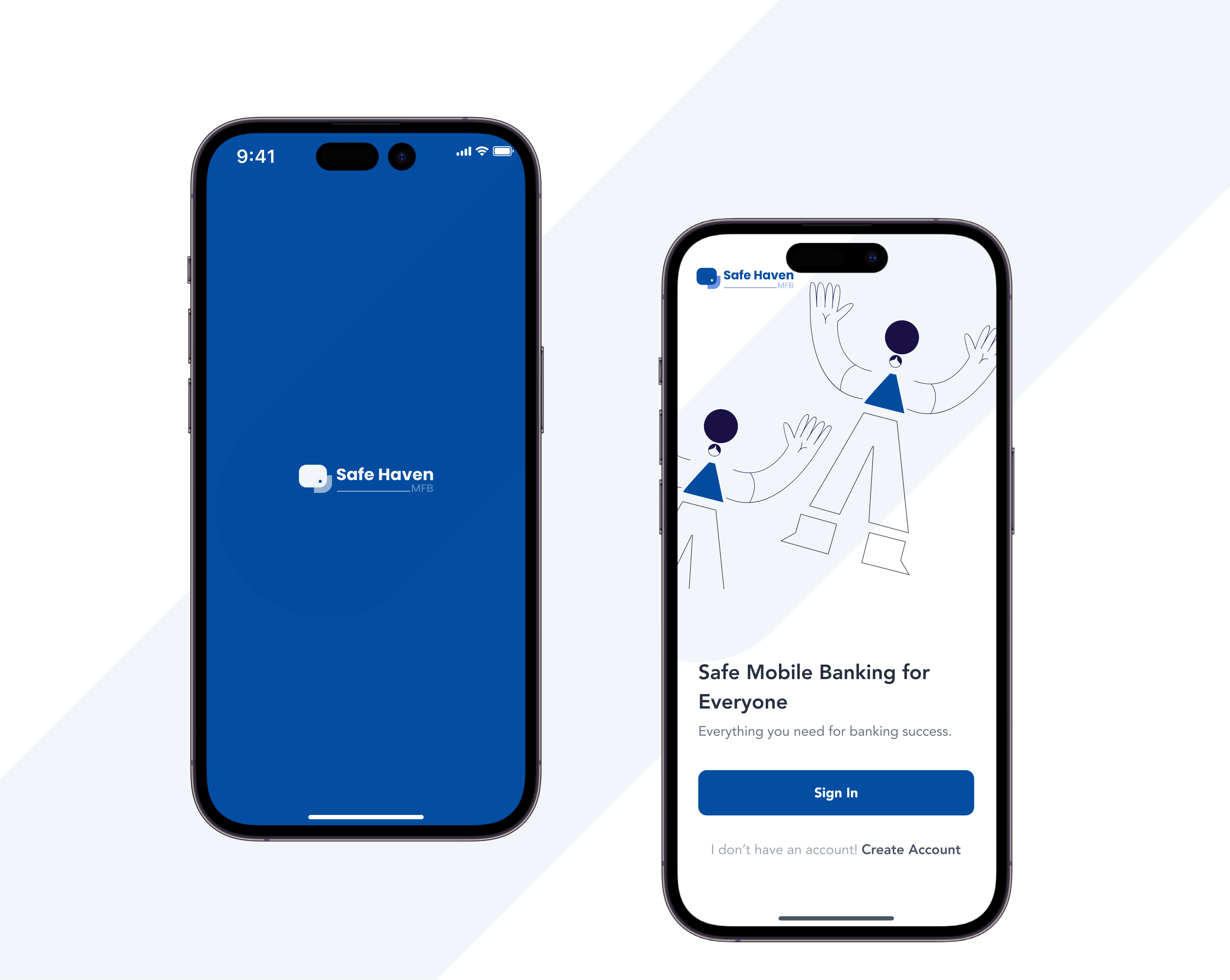
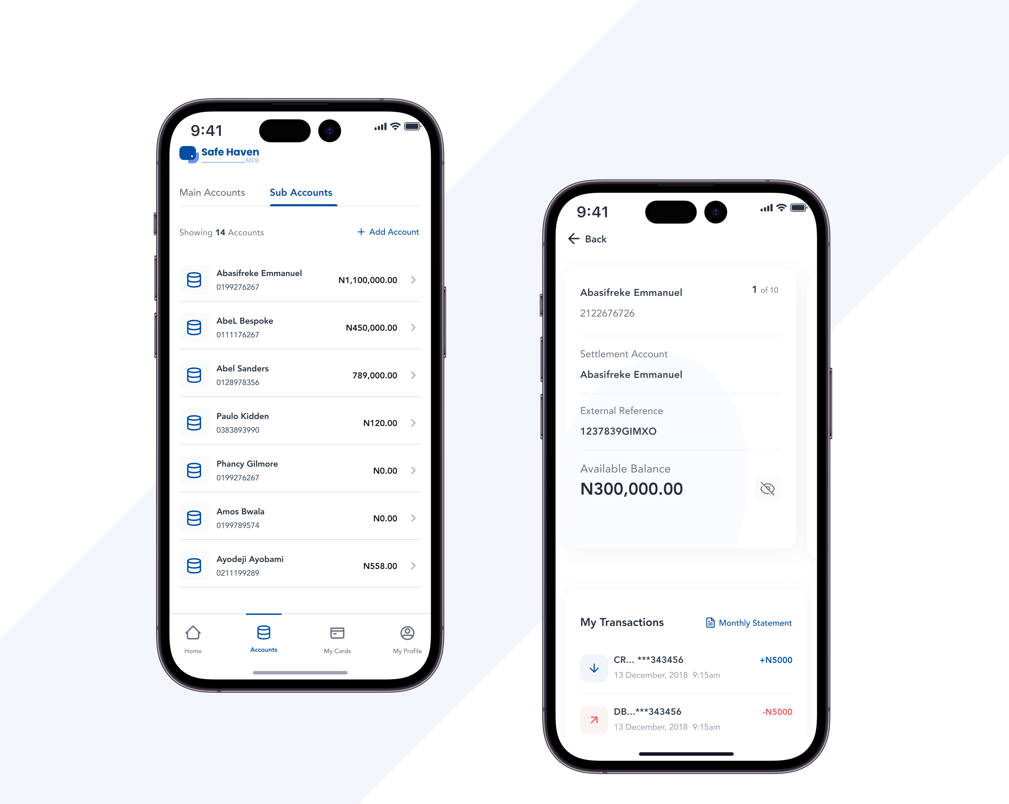
Internet Banking Infrastructure Redesign
Safe Haven Bank is a Digital Microfinance Bank. Before now it existed as a micro finance bank whose operations was centered around cash deposits,withdrawal and issuing small loans to businesses. Because of the regulations set forth by the Central Bank regarding card issuance, which mandate that any fintech company issuing cards must do so through a service bank possessing a card issuing license, Safe Haven was acquired by a fintech firm specializing in programmable card issuance.
Following the bank's acquisition, there was a necessity to realign and reconfigure the bank's infrastructure in order to align it with the intended objectives of the acquisition. This is the rationale behind the redesign of Safe Haven.
At the time of Safe Haven's acquisition, the organization was dependent on third-party software for its internal operations and adhered to a traditional banking model wherein customers were required to conduct transactions in person at the bank's physical counters. However, this operational model was incompatible with the bank's new strategic direction, necessitating a comprehensive system overhaul.
To design an internet banking system (Web and Mobile Experience) for Safe Haven customers such as would replace the traditional operational model.
I was the sole designer on this project and I collaborated with 5 stakeholders, 1 Front End Engineer, 2 Backend Engineers, a Legal and Compliance expert, 3 Finance Expert
- In my role as the UX designer for this project, I accomplished the following significant milestones:
- Advocated for user desires, needs, and pain points.
- Implemented a research-driven, human-centric design process as the project's guiding principle.
- Questioned stakeholder assumptions to guarantee user-focused solutions.
- Streamlined and realigned the project's scope for greater precision.
DISCOVER
To begin, I embarked on a comprehensive exploration of the bank's entire operational framework. This encompassed a thorough examination of transaction processes, internal record management, and related operational facets. The insights gleaned from this investigation formed the cornerstone of my discoveries.


Fig 1.0. Old Safe Haven's Website
The previous model consisted of a single-page website(screenshots shown above) primarily featuring a loan calculator as its central functionality, alongside the bank's contact information. I then proceeded to conduct a cursory examination of the historical usage patterns of the old website, revealing its primary purpose—to establish a basic online presence for the bank. It became apparent that most banking operations were traditionally conducted in-person at the physical banking hall by customers.
Old Safe Haven Bank Platform Model
.png)
.png)
As the bank was preparing to implement a comprehensive digital banking system catering to both individual customers and corporate enterprises, I conducted a series of interviews with a diverse group of 20 individuals, which included both existing bank customers potential individual users and representatives from corporate entities.
- Existing customers of the bank were frustrated with the traditional model of transacting over the counter.
- Users were interested in digital banking and emphasised their need for a very seamless and stress free transaction experience.
- Users expressed concerns about security.
- Corporate users wanted a trusted web experience with multiple accounts management.
- Users wanted to have a more intuitive experience with visible actions.There were a lot more findings but I intend to keep the details a bit brief.
As the bank was preparing to implement a comprehensive digital banking system catering to both individual customers and corporate enterprises, I conducted a series of interviews with a diverse group of 20 individuals, which included both existing bank customers potential individual users and representatives from corporate entities.


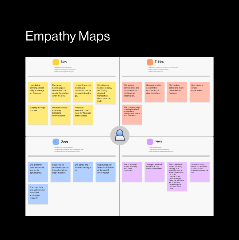
I created empathy maps to provide a deeper an more holistic view of customers' perspectives, emotions and motivations as well as helping to avoid stereotypes or generalizations

I ran a quick competitive analysis of some key neo and commercial banks some of which our potential users were using.
.svg)


Upon completing the initial research phase, the imperative arose to harmonize business requirements with user demands. To accomplish this, I facilitated a strategy session involving all relevant stakeholders. During this session, I shared crucial user-oriented insights while also delving into the realm of business requirements. Due to the constraints imposed by a Non-Disclosure Agreement, I am unable to disclose specific details of the discussion's outcomes as relating to the business. Nevertheless, the strategy session had better informed us as a team of key areas to prioritise and some of the areas are:
- Open API Banking
- Card Payments
- Loans
- InterBanking
- Loan Recovery Structures
- Bill Payments
- Digital Banking
- Banking as a Service
MAKE
First Phase
This phase is typically one of my favorites in the process because it allows for creative exploration. To kick things off, I conducted several sessions with the team to fully develop the end-to-end flow for individual features. Additionally, we engaged individual brainstorming sessions and seamlessly integrated the various flows. Some of the KEY FINDINGS where:
- Sorting out individual feature flows
- Connecting each flow to the whole system branch
- Structure a comprehensive navigation menu for all key features.
.svg)
.svg)
From the insights gathered from arranging the user flows, I started sketching an assembling mood-boards. I tapped great Ideas from modern banking design trends. Also, I collaborated on FIGJAM with stakeholders on FIGJAM in a live sketching session. Some of the Key Insights of this phase were;
- Exchange of Ideas on interface structure
- Alignment on build technology, libraries and framework
- Stakeholders alignment.
I assembled the ideas on a lo fi wireframe to be which formed the basis which the experience was going to be developed and get an alignment with the stakeholders before proceeding to the hi-fi designs

I assembled the ideas on a lo fi wireframe to be which formed the basis which the experience was going to be developed and get an alignment with the stakeholders before proceeding to the hi-fi designs
OUTCOME
The version 1.0 of the Internet banking web app and mobile app experience was launched. I set up a feedback channel to collate feedbacks gotten from users. However within the 7months;
- Safe Haven recorded 10000+ individual live accounts and over 300+ business accounts against 2500+ accounts in the previous MFB operation.
- Increased average daily transaction amounts
- API integration
- 35.18% adoption rate was recorded in the fifth month after launch.
There are few more metrics I'd like to share but I'm limited to because of the NDA.
I encountered series of challenges both externally and internally while working on this project some of them were;
- Compliance and regulations: The financial sector is heavily regulated. While working on this project, I attended series of meetings on financial policies which were changing almost weekly thus affecting some process flows.
- Constraints of Time and Resources: I would have loved to conduct some rigorous testing at different phases of the design process and would have impacted the design
- Creative Freedom: My creative freedom was a bit limited because I had to work with what was available and some of my perspective although very much nice and appreciated were put to hold
.png)


